Sunday, May 26, 2013

Dots and Doily - Blue and White

Lots of details and a crisp blue-and-white color scheme.  I like it.  The dark blue edging on the patterned paper (Copic marker, see below for more info) is a small touch, but it makes a big difference in pulling the card together visually. 

Card details:
  • Card stock is Papertrey Ink (PTI) enchanted evening (dark blue) and stamper's select white.
  • I computer-printed the patterned paper, using white text (periods) on a blue background. 
  • The patterned paper is edged with Copic marker B39. 
  • The dies are PTI snowflake flurries (pinked circle) and Parisian lace doily.
  • The dark blue circle is a 1-3/4" circle punch.  
  • The heart is punched with a 1" EK Success punch.  The right side of the heart is popped up with foam tape.
  • The  embroidery floss is DMC white.
  • The sentiment "Love you" is computer-printed in Giddyup font, using blue ink to match the patterned paper, with a darker blue text outline. 
Created for Operation Write Home, "supporting our nation's armed forces by sending blank handmade greeting cards to write home on, as well as cards of gratitude to encourage them." (287)

Saturday, May 25, 2013

Thank You Card - OWH Blog Hop

Stars and a muted color scheme with white, gray, dark red (burgundy), and light blue.  Lots of texture in the layers and embossing.  It's for the 2013 Memorial Day Weekend blog hop, sponsored by Operation Write Home.  A small way to say "thank you" to our heroes and their families protecting and serving our nation. 

My card is based on OWH sketch #68.   The sketch and card details are at the bottom of my post.  All of the OWH sketches (over 200 of them!) can be found here - a wonderful resource for card makers. 

Thanks for visiting, and especially thanks for your comments.  To return to the OWH blog hop page and continue hopping, click HERE
Card details:
  • Card stock is Ellen Hutson white linenPapertrey Ink (PTI) soft stone (gray), scarlet jewel (burgundy), and spring rain (light blue). 
  • Embossing folder is Craft Concept solid stars.
  • Dies are PTI photo finish strips for the sentiment strip,  PTI seeing stars (medium) for the largest star, and My Favorite Things stacking stars (large) for the two smaller stars.
  • I used a 1/4" Fiskars star punch for the tiny center star. 
  • Sentiment "Thank you" is computer-printed in burgundy ink with "Marker Felt - Thin" font.
Created for Operation Write Home, "supporting our nation's armed forces by sending blank handmade greeting cards to write home on, as well as cards of gratitude to encourage them." (283)

Tuesday, May 21, 2013

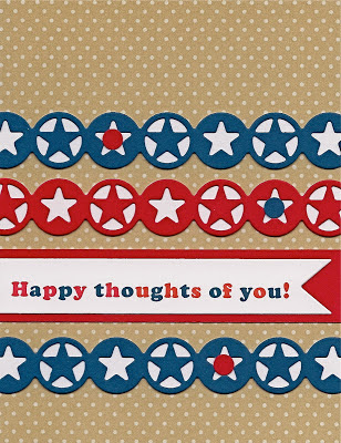
Star Circles - Red, White, and Blue with Tan

A happy, bright card with a happy sentiment!  I like the contrast and the starry circle shapes.  The die set cuts an open "lacy" star, with the option to add a solid layer beneath it for contrast (white in my card).   I added more variety by alternating the horizontal placement of the two star shapes.   It still needed something more, so I added a triangle of accents with the little dots on a few stars. 

Card details:
  • Card stock is Neenah solar white, Papertrey Ink (PTI) pure poppy (red), enchanted evening (dark blue), and the bitty dots print from PTI fine linen (tan) pattern pack.
  • Dies are PTI sketched shapes (wide banner) and My Favorite Things western star border duo.   
  • I added a few dot accents, punched with a 1/4" hole punch.  
  • Sentiment "Happy thoughts of you!" is computer printed with red and blue ink using Cooper Black font, expanded spacing.  I increased the font size of the "!" which looked too small otherwise. 
Created for Operation Write Home, "supporting our nation's armed forces by sending blank handmade greeting cards to write home on, as well as cards of gratitude to encourage them." (285)

Sunday, May 19, 2013

Red and Blue Banners - Hi

Lots of texture and pattern with strong colors and a simple layout.  For the Operation Write Home midweek challenge "so sentimental," using a sentiment as focal point. 

Card details:
Created for Operation Write Home, "supporting our nation's armed forces by sending blank handmade greeting cards to write home on, as well as cards of gratitude to encourage them." (284)

Saturday, May 18, 2013

Brown with Red and Pink Hello

Several banners in varying widths and lengths.  I like the overlapping effect.  The embossed branches echo the pink print.

For this month's "Variety is the Spice of Life" (variation) lesson in Paula's Operation Write Home Design Bootcamp.  In my banners, I tried to include variation in value (light and dark), texture (varying patterns), color (red, pink, and brown), shape (square and notched ends), and size (length and width).  Thank you, Paula, for all your bootcamp instruction and inspiration! 

Brown with pink is one of my favorite color combinations.  In real life, the solid pink color looks a bit more orange, and it works well with the pink print.

Card details:
  • Card stock is all by Papertrey Ink (PTI)  - dark chocolate (brown) and sweet blush (pink),  pink print from pretty pastels, pure poppy (red) bitty box print,  and bitty dots print from dark chocolate pattern pack
  • Dies are PTI buttoned up #2 and Savvy Stamps hello.  I cut off about 3/16" of the tail of the "o" to fit better on my layout.
  • The banner notches are cut with a square punch.
  • Embossing folder is from Cuttlebug "just my type" set. 
  • Embroidery floss is DMC #347.
Created for Operation Write Home, "supporting our nation's armed forces by sending blank handmade greeting cards to write home on, as well as cards of gratitude to encourage them." (281)

Monday, May 6, 2013

Blue Rectangles with White - Before and After

"After" with sentiment in Harrington font
A blue-and-white thank you card, for the weekend's virtual card making party at Operation Write Home.   I used sketch #171 with two shades of blue, two patterned papers, three rectangles, and a white ribbon knot.  Updated May 18, 2013:  I just wasn't happy with my original "thank you" sentiment (shown below, in the "before" version).  Though I've used the Stencil font successfully on other cards, here it just looked too plain and boring.  I wanted something with a bit more flair and visual interest.  Harrington font (shown above, in the "after" version) looks a lot nicer to me.  Now I'm happy!  Always interesting to see the big difference of a small change in one element.  

"Before" with sentiment in Stencil font
Card details:
  • Card stock is Papertrey Ink (PTI) blueberry sky (medium blue), stamper's select white, and the stripes and gingham prints from PTI enchanted evening (dark blue) pattern pack.
  • Ribbon is 3/8" white grosgrain.
  • Dies are Spellbinders labels one, smallest two die sizes. 
  • Sentiment "Thank you" is computer-printed with blue ink using Harrington font (for the "after" card).  The "before" card used Stencil font.  
Created for Operation Write Home, "supporting our nation's armed forces by sending blank handmade greeting cards to write home on, as well as cards of gratitude to encourage them." (282)