Wednesday, January 30, 2019

Birthday - Green and White with Blue Plaid

Bold and simple for a masculine birthday card.  I like the two shades of green with two shades of blue, lots of crisp white, and sentiments big and small.  

Card details:
  • Card stock is Papertrey Ink (PTI) new leaf (green) and stamper's select white.
  • Patterned paper is from blueberry sky (medium blue) bitty big pattern pack.
  • White panel is edged with Copic marker YG23.
  • Twine is denim stripe from The Twinery.
  • The tiny repeating sentiment "happy birthday" is from PTI fill in the blank (retired), stamped with PTI green parakeet ink cube.  
  • The large "happy birthday" is from PTI think big favorites #12, stamped with PTI fresh snow (white) pigment ink cube and white heat embossed.
(998)

Thursday, January 24, 2019

Yellow Rays Print with Red, Blue, and Golden Brown

I tried a few different background colors to go with my yellow, red, and blue.  The golden brown worked surprisingly well.  I like how it seems to brighten the rays inside the red border. 

Card details:
  • Card stock is Papertrey Ink (PTI) pure poppy (red), enchanted evening (dark blue), and honey nut (golden brown).
  • Patterned paper is from PTI comic strip A2 paper pack (retired).
  • Die is PTI big basics: thanks.
Created for Operation: Quiet Comfort.
(997)

Sunday, January 20, 2019

Confetti Dot Corners - Red, Teal, and Yellow-Orange

Playing with a new confetti dot stamp set... I'll get some good use from these dots in different ways.  For this card, I put a corner stamp and the two smaller stamps in my MISTI, then shifted the card stock to stamp with the different colors.  Easy to do, and I like the results.

Card details:
  • Card stock is Papertrey Ink (PTI) pure poppy (red) and stamper's select white.
  • Patterned paper is from PTI summer sunrise (yellow-orange) pattern pack (tone-on-tone prints - retired).
  • The sentiment "just a note to say thanks" is from PTI sentiment staples: just a note, and the confetti dots are from PTI corner adorner: January, stamped with PTI tropical teal, pure poppy, and summer sunrise ink cubes.
Created for Operation: Quiet Comfort.
(996)

Blue Print with Cream Label on Tan Stripe

A bit of a vintage look - not at all the card I started to make.  It just evolved this way.  And I do like it, for a change.  In real life, the sentiment stands out more clearly.

Card details:
  • Card stock is Paper Source pool (aqua) and Papertrey Ink (PTI) vintage cream.
  • Patterned paper is from PTI fine linen (tan - stripe) pattern pack (tone-on-tone prints - retired) and from Carta Bella 12 x 12" all bundled up/ snowflake swirl
  • The cream label is roughly edged with Copic markers E41 and E43.  The blue print is edged with E43.
  • Dies are My Favorite Things scallop ribbon border (retired) and the smallest die from Spellbinders labels one.
  • The sentiment "thank you so much" is from PTI thank you kindly (retired), stamped with PTI aqua mist (aqua) and spring rain (light blue) ink cubes to match the Paper Source pool card stock.
Created for Operation: Quiet Comfort.
(995)

Saturday, January 19, 2019

Leaves on Aqua Circle with Rusty Red

This very simple card has a lovely glow in real life.  The narrow lines of the rusty red border and sentiment add a touch of spice, without overpowering the curving green leaves and sponged aqua circle on the light gray.  Overall, I'm very happy with it. 

Card details:
Created for Operation: Quiet Comfort.
(994)

Tuesday, January 15, 2019

Red, White, and Blue Diagonal Frame with Star

My card today was inspired by the beautiful aqua and green card on Melissa Bickford's Just Dandy Studio blog.  I used her idea for the colorful background strips, but her diagonal frame placement didn't work out for me.  Maybe another time!  I love the crisp effect of the white stripes over the blocks of red and blue.  Thanks, Melissa, for all of your inspiration!

Note: the gray border is background, not part of the card.

Card details:
Created for Operation: Quiet Comfort.
(993)

Saturday, January 12, 2019

Chevron Birthday - Pink on Gold Shimmer

This one was fun to make!  I love the texture created by stenciling a design after embossing it.  My stack of pink words and shapes sends a festive message with words, hearts, and a bow.

Card details:
  • Card stock is Papertrey Ink (PTI) gold shimmer, berry sorbet (orangey pink), and stamper's select white.
  • The white card stock is embossed with a stencil from PTI modern background collection.  See this post for the technique and warnings.
  • After embossing, I stenciled the design with PTI berry sorbet, orange zest, and summer sunrise (yellow-orange) ink cubes, using round Ranger ink blending tools to apply the ink.
  • Dies are from PTI tipped tops (happy word), PTI heart border, and Elizabeth Craft happy birthday (birthday word). 
  • The bow on the 1/4" strip is punched with Martha Stewart bow.
(992)

Thursday, January 10, 2019

Abstract Scene - Purple, Green, and White

 Purple, green, and white in a simple card layout with an abstract stamped scene.  I like the variety of interesting shapes and patterns in Papertrey Ink's grunge me (retired) stamp set, and it was fun using some to create my little scene.  The strip of eyelet lace works well with the many dots and circles in my stamping. 

Card details:
  • Card stock is Papertrey Ink (PTI) new leaf (green), amethyst allure (purple), and stamper's select white.
  • Die is PTI eyelet lace border.
  • The sentiment "thanks" and the images are all from PTI grunge me (retired), stamped with PTI new leaf and amethyst allure ink cubes.
Created for Operation: Quiet Comfort.
(991)

Sunday, January 6, 2019

Nine Card Designs from 6x6 Scraps

Nine designs, eighteen cards, featuring the scraps and unloved pages from a five year old 6x6" patterned paper pack.  For some designs, I was able to make two or four of each; others are one of a kind.  I enjoyed the challenge to use it all up, while adding as few extra pieces as possible.  Just a few inches of faintly patterned grid paper went into my trash.  Below is a photo of my finished assortment.  (If it looks a bit blurry, click on it for a better view.)


Though I didn't feel obliged to use everything from the paper pack, it was fun to see what I could do with the last bits of it - which, of course, were random off-cuts and not-so-interesting patterns.  To see the other designs (less scrappy) that I made from it over the years, click here

Card details:
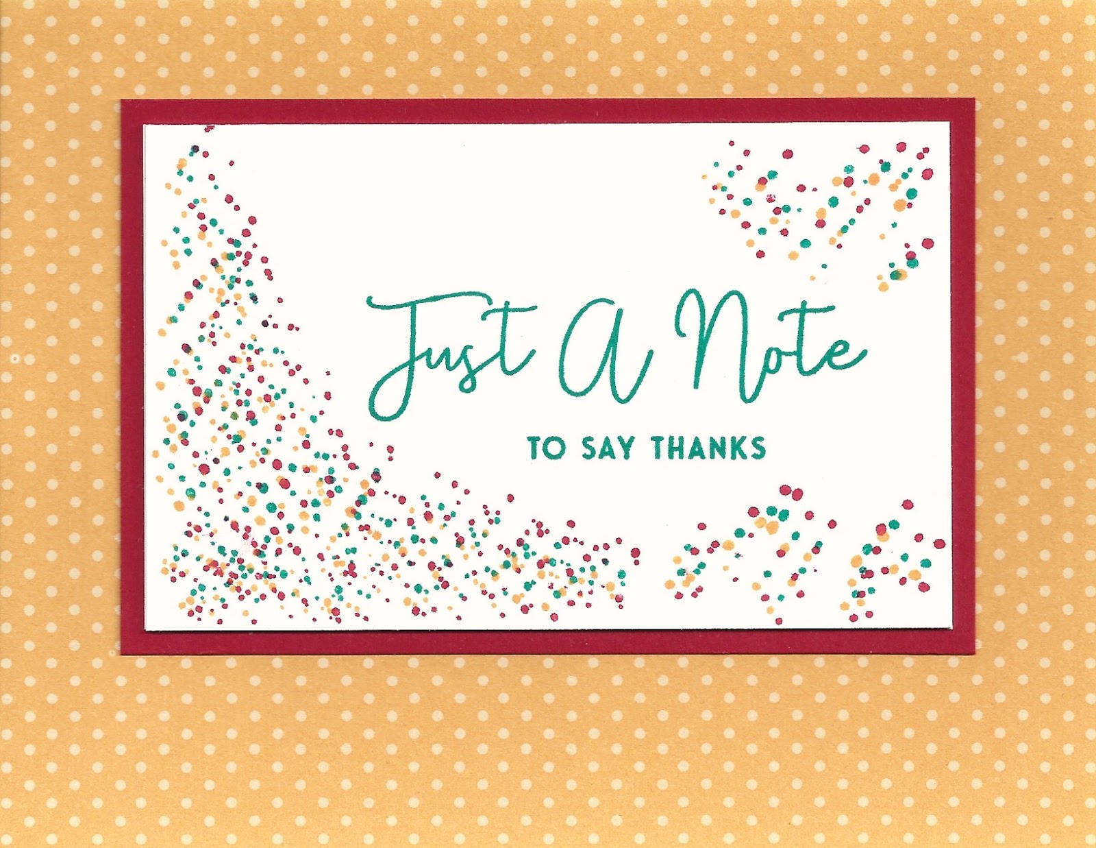
  • Card stock is Essentials by Ellen tan woodgrain, My Favorite Things red hot (red), Paper Source leaf (light green - retired) and curry (gold), and Papertrey Ink (PTI) ocean tides (muted teal), canyon clay (orangey brown), soft stone (light gray), melon berry (light orange), terra cotta tile (rusty red), fine linen (light tan), enchanted evening (dark blue), and vintage cream.
  • Patterned paper is mostly from Pink Paislee portfolio 6 x 6" collection.  I also used some pieces of bitty dot print from PTI ocean tides pattern pack (tone-on-tone prints - retired), and a polka dot border strip, left over from a PTI monthly moments (retired) paper sample.
  • On several cards, I used the Stampin' Up subtle embossing folder.
  • Embroidery floss is DMC 676 (light yellow) and 926 (muted teal).
  • Word dies are My Favorite Things many thanks (retired), PTI huge thanks, and Birch Press sugar script hello.
  • Other dies are PTI number the stars banner, PTI eyelet lace border, and PTI keep it simple frames.
  • Punches are EK Success mini retro flower and an old 1/4" office supply hole punch. 
  • I edged a few pieces with Copic marker BG72.
Created for Operation: Quiet Comfort.
(990)

Friday, January 4, 2019

Chevron Print - Black, Gray, and Red

I started this card with the black and white chevron print, then decided to try it with a dark gray card stock.  The red and white frame element breaks up the busy chevrons but needed something to ground it better.  So I pulled out my bag of ribbons and was happy to find a perfect gray match.  I like the bold simplicity of the finished card.

Over the years as I've ordered from Ellen Hutson, one of my favorite sources for card making and art supplies, I've received many colors of ribbon as one-yard "thank you" treats with my packages.  This color arrived in my latest order ... thank you, Ellen!

Card details:
Created for Operation: Quiet Comfort.
(989)

Wednesday, January 2, 2019

Bright Flowers on Aqua with Green

Bright, happy colors for a trio of flowers.  I stamped them on a pale pink card stock, which gave me a nice background around the petals.

Card details:
  • Card stock is Papertrey Ink (PTI) sweet blush (pale pink) and aqua mist.
  • Patterned paper is from PTI new leaf (green) pattern pack (tone-on-tone prints - retired).
  • Dies are PTI notched flowers.
  • The sentiment "hello" is from PTI colorful words (retired), stamped with PTI new leaf ink cube.  The flowers are from PTI funky florals, stamped with orange zest, hibiscus burst (bright pink), pure poppy (red), harvest gold (yellow), and scarlet jewel (burgundy) ink cubes.
Created for Operation: Quiet Comfort.
(988)

Tuesday, January 1, 2019

Green and Brown Print with Cream Banner

Simple layout, interesting colors, for a handsome masculine card.  I like how the rustic red ink and card stock bring out the color of the X's (which are actually brown) in the patterned paper.

I'm very grateful for the courage and dedication of our military men and women who serve our country, and all who protect our public safety.  That's why I make cards for Operation: Quiet Comfort.  So a thank you card is a good way to start a new year on my blog.  Wishing a happy and peaceful 2019 to all!

Card details:
Created for Operation: Quiet Comfort.
(987)