Showing posts with label before and after. Show all posts

Friday, May 25, 2018

Burgundy Stripes with Kraft Panel - Before and After

(After) 

My "before" card (at bottom of post) was one-of-a-kind, using a short scrap of hole-y paper from a friend's ribbon box.  When I tried to identify it, I learned it was the backing from a type of veneer tape.  Perfect for a thank-you note for this friend, whose cards make creative use of all kinds of "found" materials.

I liked the design well enough to make more, with card stock instead of veneer tape backing.  My hole-y die was narrower than the tape backing, with larger holes, and it looked better in a portrait orientation, with wider embossed stripes from a different embossing folder.  But the overall "after" effect (at top of post) is very close to the original.  Thank you, Judy, for sharing your stash and inspiring my cards!

Card details:
 (Before)
Top card created for Operation: Quiet Comfort.
(890)

Saturday, March 31, 2018

Purple with Light Orange Flowers - Before and After

-After-

For this week's Transformation Tuesday challenge on the Papertrey Ink blog, I chose a recent card and made a small change that, to me, makes a big difference.  Although I liked the colors and overall layout of my "before" card (below), it looked rather scattered and incomplete to me.  I considered a bigger redesign, but instead, I decided to try one small addition to pull it together - the partial flower at the center right in the "after" version (above).  It works so much better now.  Thank you, Melissa and PTI, for inspiring and encouraging me to take another look at my design!

 
-Before-

Card details:
  • Card stock is Papertrey Ink (PTI) stamper's select white.
  • Patterned paper is the bitty dot print from PTI amethyst allure bitty big pattern pack.
  • The flowers and leaves are from PTI floral sketches, stamped with PTI amethyst allure (purple), melon berry (light orange), vintage jadeite (green), and dark indigo (dark navy) ink cubes.
  • I used a white gel pen to add dots in the flower centers.  
  • The sentiment "hugs" is from PTI penned elegance alphabet, stamped with PTI dark indigo ink cube.
(865)

Wednesday, February 7, 2018

Purple Butterfly on White Doily - Before and After

After

For today's "transformation" challenge on the Papertrey Ink (PTI) blog, I chose a card from 2013 as my "before" card (below).  Though it has some nice elements, they just didn't work together.  The soft paper doily got lost in the mix, the butterfly looked too small and too heavy, and my overall design felt very disconnected.  

When I reworked the design today, I kept the same color scheme with a butterfly on a white doily and a dark horizontal bar.  But I changed the patterned background to embossed texture, and I used a larger and lacier butterfly, placed on a much more visible white doily.  The "after" version (above) works for me now, and I'm glad I tried the transformation!  Thank you, PTI, for an interesting challenge today!

Before  
(Note: the gray border is background, not part of the card)

Card details for "after" card:
Card details for "before" card are in this post.
(837)

Tuesday, November 28, 2017

Scene with Fence, Trees, and Cat - Before and After

My sweet scene today revisits this "before" card, one of my favorites from four years ago.  My "after" design is a bit simpler and uses some patterned papers instead of the Copic marker details. 

Usually when I revise a card, I prefer the newer version.  But in this case, I like them both.  The "before" has a more painterly, cozy feeling, and today's "after" is more crisp and graphic in style.  

Card details:
  • Card stock is Papertrey Ink (PTI) pure poppy (red), aqua mist, cocoa bean (medium brown), summer sunrise (yellow-orange), and rustic cream.
  • Patterned papers are the bitty dot, leaf, and stripe prints from PTI ripe avocado (green), summer sunrise, and classic kraft pattern packs (tone-on-tone prints - retired).
  • Dies are PTI picket fence, PTI ad sense (sun), PTI polka dot parade #6, PTI star gazer (tiny sun shape on bow), Impression Obsession cat set, My Favorite Things fresh cut grass, and WPlus9 pretty patches: tree (retired).
  • Punch is Martha Stewart bow.
  • The cat's eyes are tiny dots of brown Micron pen.
  • The sentiment "thinking of you" is from PTI keep it simple: thinking of you, stamped with PTI cocoa bean ink cube.
(329)

Monday, February 6, 2017

Birdhouse Scene - Before and After

"After" card

Sometimes it's fun for me to remake an older card, and this design was one of my favorites from 2012.  Bright and cheerful, with lots of detail and texture.  With the few changes I made, I like it all the more. 

The changes are: a smaller turquoise panel without ribbon, a tone-on-tone damask print instead of the embossed solid color, and a different sentiment.  See below for original card.

Card details for the "after" card (above):
  • Card stock is Papertrey Ink lemon tart (yellow), aqua mist (light aqua), Hawaiian shores (medium turquoise), new leaf (green), pure poppy (red), scarlet jewel (burgundy), and damask print from PTI lemon tart pattern pack.
  • The bird, leaves, and birdhouse dies are from WPlus9 Folk Art Florals (retired). 
  • The sun is 1/4 of a 2" scalloped circle, embossed with two small Spellbinder circle dies to provide some texture.
  • The sky is embossed with Cuttlebug D'vine Swirls embossing folder.
  • The sentiment "sending sunshine" is computer-printed in teal ink with Milkshake and Courier fonts.
Card details for the "before" card (below):  Posted here.
(154)
"Before" card

Saturday, November 5, 2016

Red Cardinal on Gray - Before and After

When I was working on yesterday's card, I found a very old swirl-embossed piece of gray.  As I started to throw it away, I thought "winter sky" and was glad I saved it.  I've found a lot of inspiration from trying to use my leftovers!

My first card (at left) used a medium green, and it seemed to need more contrast against the gray.  I prefer the second card with a darker green, but both are nice. 

Card details:
  • Card stock is Paper Source (PS) spruce (dark green - was discontinued, but is available now as a seasonal color), PS gravel (gray),  Papertrey Ink (PTI) new leaf (medium green), PTI pure poppy (red), and PTI stamper's select white.
  • Embossing folder is Cuttlebug d'vine swirls.
  • Dies are PTI winter woods, PTI keep it simple frames, WPlus9 folk art florals (retired - leaves), and Savvy Stamps hello.
  • The berries are punched with EK Success 3/16" circle punch.  I added the centers with a Copic 1.0 black multiliner. 
  • The black detail on the bird is from PTI winter woods, stamped with PTI true black ink cube.
Created for Operation: Quiet Comfort.
(654)

Friday, May 27, 2016

Beach Waves - Before and After

My card, above, is the "after" version of an earlier scene, shown below.  Originally, my scene with beach, waves, and sun seemed to call for a landscape (horizontal) orientation.  But I wanted a bigger sun, and so I tried today's portrait (vertical) idea. 

It works so much better!  Less crowded, more expansive looking.  I like the layered sun and the white birds.  I'm very glad I tried something different with my design.

Card details:
  • Card stock is Paper Source pool (bottom wave), Papertrey Ink (PTI) aqua mist (sky), fine linen (beach), Hawaiian shores (middle wave), ocean tides (top wave), harvest gold (inner sun), summer sunrise (outer sun), and stamper's select white (birds).
  • Dies are Memory Box flying birds (on left), Impression Obsession sm. bird set (on right), and PTI XL rickrack border, heart-2-heart #6, and snowflake flurries.
  • The sentiment " *** thinking of you *** " is computer-printed in dark tan ink using Chalkduster font, bold. 
Created for Operation: Quiet Comfort.

Below is my "before" version, posted here.  (It was created for Operation Write Home.)  Both cards have the same colors, except for the sun, which is PTI lemon tart in the "before" card.

(205)

Saturday, July 4, 2015

Red, White, and Blue with Hearts

Celebrating the Fourth of July with a red, white, and blue card for Operation Write Home.  I like the angled hearts with those bubbly dots.

Today's card is another "after" version of the cards in this post, with many of the same design elements and supplies.  It might be my favorite of the three.

Card details:
Created for Operation Write Home, "supporting our nation's armed forces by sending blank handmade greeting cards to write home on, as well as cards of gratitude to encourage them." (481)

Saturday, June 27, 2015

Hearts Print with Banner - Before and After

After
A card with some red, white, and blue Love for Operation Write Home's June banners challenge.  With our OWH August 1 deadline coming soon, I wanted to use up the rest of this hearts print and those sweet tiny words - "Be mine, Forever and always, You make me happy" and more.

So I adapted the layout from an earlier card (shown below) while using most of the same materials.  Both cards are nice, but I think the "after" card (above) is more vibrant with the wide red banner and lively embossing pattern.

Edited July 4, 2015 to add:  See this post for another "after" version. 

Card details:
  • See this post for materials used on both cards.
  • The only new supplies on the "after" are - Added some red embroidery floss (DMC 347) and changed embossing folder to Sixxix retro cirque (retiring.)
  • On the "after" card, I forgot to edge the hearts print with B39 Copic marker like the "before"card.  It looks better with the edging (below.)
Before
Both cards were created for Operation Write Home, "supporting our nation's armed forces by sending blank handmade greeting cards to write home on, as well as cards of gratitude to encourage them." (387)

Monday, February 23, 2015

Typewriter Embossing with Red and White - Before and After

"After" with blue
For today's card, I used one of my older designs, but with blue instead of kraft.  It's fun to remake my cards sometimes.  Usually I prefer the new version, but this time I like them both.  See below for the original card.

Card details:
  • Click here for the original card post with all the supply details.  The only change is blue vs. kraft.  
  • In place of the kraft color, the blues are Paper Source lake and the bitty dot print from Papertrey Ink blueberry sky pattern pack.
Created for Operation Write Home, "supporting our nation's armed forces by sending blank handmade greeting cards to write home on, as well as cards of gratitude to encourage them." (309)

"Before" with kraft

Saturday, February 8, 2014

Blue Thank You with Dots - Before and After

 
                       After                                                 Before (timed version)

For today's Papertrey Ink 7th Anniversary limited supply Timer Challenge - select 7 items in 7 minutes, and then 17 minutes to complete the card.  I had a few "oops" moments, but I got it done before the buzzer!

My 7 items are 3 card stock colors, 1 word die, and 3 lengths of stitching line dies.   Thank you Nichole for a fun challenge!

Edited February 8 to add:  The "limited supply" part of the challenge was more enjoyable for me than the "timer" part.  I began with a general idea of my card design, but then, of course, no time to refine it.  I'd like this card better with my diagonal layers cut to the same angle as the pattern paper dots, and narrower to close up the space above the sentiment.  In my "after" version, some knotted twine (denim and shore from The Twinery) fills the excess space.  It also hides a smudge (not visible on the scan, but very obvious to me in real life!) that in my haste I didn't notice.  I'll try this design again with a few changes. 

Card details:
Created for Operation Write Home, "supporting our nation's armed forces by sending blank handmade greeting cards to write home on, as well as cards of gratitude to encourage them." (352)

Saturday, November 16, 2013

Blue Stitched Heart with Doily - Before and After

After
Blue patterns with white texture from the die-cut doily and the hand-stitching.  I like this card a lot!  See end of post for my "before" version from last year.  

Card details:
Created for Operation Write Home, "supporting our nation's armed forces by sending blank handmade greeting cards to write home on, as well as cards of gratitude to encourage them." (328)

Last year I made a similar card (click here for details) shown below.  It was a very nice card, but I do like today's better.  It's fun for me to take an older card and see how I can adapt or even improve it.

Before

Saturday, August 10, 2013

Large Banners - Blue, Yellow, and White - Before and After

           After                                                                   Before

A card for the "major, minor, and accent" lesson in the Operation Write Home design bootcamp series.  My color choice was the second option: dark blue (major), bright yellow (minor), and white (accent). 

Edited August 10:  added notes in italics and posted "after" card:  I glued on a few small stars, and I like it better now, compared with the "before" version.  It's growing on me.  I'll make another one, substituting a textured white linen  cardstock for the plain Neenah white.  And maybe shorten the tail of the "o" a bit more, instead of placing it all the way to the edge of the card.  It's fun to see the impact of a few small changes.  

Before I thought of adding the stars, I didn't enjoy working on this one.  Maybe I was too focused on the 60-30-10% equation, which I didn't get right anyway.  But the card turned out okay.  Thanks, Paula, for a very educational series!  And I'm glad I persisted till I got to my "after" version. 

Card details:
  • Card stock is Neenah solar whitePapertrey Ink (PTI) enchanted evening (dark blue), and the leaf and polka dot prints from PTI enchanted evening and summer sunrise (yellow) pattern packs.
  • The banner ends are notched with a square punch.
  • Dies are Savvy Stamps hello and PTI star gazer
Created for Operation Write Home, "supporting our nation's armed forces by sending blank handmade greeting cards to write home on, as well as cards of gratitude to encourage them." (305)

Sunday, July 21, 2013

Bird with Heart Frame on Blue - Before and After


Three cards with almost the same ingredients.  The two "before" cards (below) are also nice, but my final card (above) is my favorite.  I'll try to explain why:
  • Design: The butterfly version (below right) has the same colors as above, but a different design.  I like the interplay of the leafy branch (above) with the heart frame and bird, better than the butterflies, which leave the frame more empty.
  • Colors: The "blue bird" version (below left) has the same design as above, but with different colors.  In the card above, I really like the bright touch of yellow, and the bird has more impact in terra cotta than in blue.

Card details:
  • Card stock is Ellen Hutson white linen, Hero Arts latte (brown), Papertrey Ink (PTI) blueberry sky (medium blue), terra cotta tile (rust), summer sunrise (deep yellow), harvest gold (medium yellow for one butterfly), and the bitty dots print from PTI spring rain (light blue) pattern pack.
  • The bird's eye is a dot of Copic 0.5 cobalt multiliner
  • Embossing folder is Cuttlebug d'vine swirls.
  • Dies are PTI sketched shapes (wide long banner), PTI framed out #11 (heart frame), Impression Obsession birds, and Poppystamps Dies meadow leaf.
  • Punch is EK Success small butterfly.
  • Sentiment "love you" is computer-printed in blue ink, with a darker blue outline, in Brush Script Std font. 
Created for Operation Write Home, "supporting our nation's armed forces by sending blank handmade greeting cards to write home on, as well as cards of gratitude to encourage them." (294)

Monday, May 6, 2013

Blue Rectangles with White - Before and After

"After" with sentiment in Harrington font
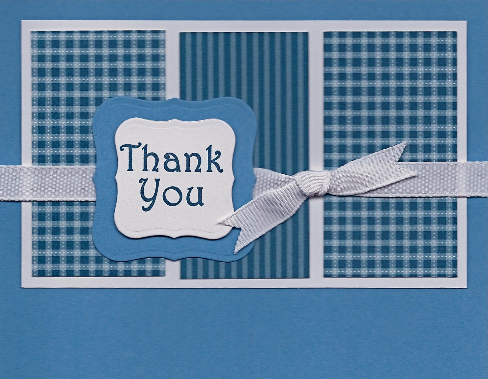
A blue-and-white thank you card, for the weekend's virtual card making party at Operation Write Home.   I used sketch #171 with two shades of blue, two patterned papers, three rectangles, and a white ribbon knot.  Updated May 18, 2013:  I just wasn't happy with my original "thank you" sentiment (shown below, in the "before" version).  Though I've used the Stencil font successfully on other cards, here it just looked too plain and boring.  I wanted something with a bit more flair and visual interest.  Harrington font (shown above, in the "after" version) looks a lot nicer to me.  Now I'm happy!  Always interesting to see the big difference of a small change in one element.  

"Before" with sentiment in Stencil font
Card details:
  • Card stock is Papertrey Ink (PTI) blueberry sky (medium blue), stamper's select white, and the stripes and gingham prints from PTI enchanted evening (dark blue) pattern pack.
  • Ribbon is 3/8" white grosgrain.
  • Dies are Spellbinders labels one, smallest two die sizes. 
  • Sentiment "Thank you" is computer-printed with blue ink using Harrington font (for the "after" card).  The "before" card used Stencil font.  
Created for Operation Write Home, "supporting our nation's armed forces by sending blank handmade greeting cards to write home on, as well as cards of gratitude to encourage them." (282)

Sunday, February 3, 2013

Dots and Stars - Two Color Schemes

  New card - Complementary colors            Original card - Monochromatic colors

To kick off the Operation Write Home Stars and Stamps Design Bootcamp, led by Paula, we're learning The ABC's of Color (Basic Color Theory).  The assignment is to use one of several color harmonies for a card.

I chose to remake one of my monochromatic cards.  For complementary colors on the new card, I added a pinkish purple (which looks bluer on the screen than in real life.)

I like both cards, and it's interesting to see the difference of the color scheme.  Thank you, Paula!

Card details - complementary colors:
Card details - monochromatic colors:
  • Click here for original card post.
Created for Operation Write Home, "supporting our nation's armed forces by sending blank handmade greeting cards to write home on, as well as cards of gratitude to encourage them." (232)

Sunday, November 4, 2012

Butterflies - Before and After - Yellow, Orange, and Brown

 Before                           and                               After

This week's featured cardmaker for Operation Write Home is Renae C.   The first of her featured cards inspired me to try something similar - three blocks of patterned paper and a large sentiment circle with images.   Thank you, Renae! 

My first attempt, the "before" card, isn't bad.  But the yellow butterfly needs more contrast, and it seems to pull my attention away from the sentiment. 

For my "after" card,  I made both butterflies orange.  Then, to echo the yellow at the top of the card, I added some yellow to the sentiment circle.  Also I added some embossed texture to the butterflies.  I think the "after" card has much better eye appeal. 

Card details:
  • Card stock is Neenah solar white (sentiment circle) and Papertrey Ink dark chocolate (card base), orange zest (butterflies), and In Bloom patterned paper in summer sunrise (bright yellow), melon berry (light orange - not so pink in real life), and orange zest.   The "before" card also includes summer sunrise card stock (large butterfly). 
  • The dies are Impression Obsession butterflies and Spellbinders (2-5/8" circle).  
  • I colored the butterfly antennae and bodies with E29 Copic marker.  On the "after" card, I added texture to the butterflies with Darice dot point embossing folder.   
  • The sentiment "Miss you." is computer printed with brown ink in Brush Script MT Italic font.  The brown and yellow circles are also computer printed. 
Created for Operation Write Home, "supporting our nation's armed forces by sending blank handmade greeting cards to write home on, as well as cards of gratitude to encourage them." (216)

Sunday, September 2, 2012

Tan with Brown - Psalm 23 - Before and After

Two versions: "Before" (left) and "After" (right)

Today I have a "before and after" card, for the September challenge sponsored by Our Daily Bread Designs (thank you, ODBD!) to benefit Operation Write Home.  This month's challenge theme is to make a card which includes either a Scripture verse, or an uplifting quote or sentiment.  I chose the 23rd Psalm. 

On my "before" card (left),  the text (though legible) didn't stand out very well on the striped paper, and the layer looked bumpy going over the twine strands.  On my "after" card (right),  I used my striped paper for the background, not for the sentiment, and I popped up the Psalm panel on some foam tape. A big improvement!  You can click on either card for a better view. 

Card details:
  • Card stock is Papertrey Ink fine linen (tan), dark chocolate (brown), and stripes from the fine linen pattern pack.  
  • Twine is rustic jute button twine from Papertrey Ink.
  • The embossing folders are Stampin Up square lattice on the "before" card base, and Craft Concept solid stars on the brown layer for both cards.
  • The little brown stars are punched with a Fiskars hand punch.  
  • The 23rd Psalm is computer-printed with brown ink using "Handwriting Dakota" font (bold, expanded spacing.)  The double-line border around the Psalm is also computer-printed. 
Created for Operation Write Home, "supporting our nation's armed forces by sending blank handmade greeting cards to write home on, as well as cards of gratitude to encourage them." (197)

Saturday, February 25, 2012

Green Large Dots Card with Purple - Before and After

A new Memory Box die, "tender leaves," inspired me to revisit a card (below) from 18 months ago. One of my earliest designs, it had some nice ideas, but just didn't add up to much. The new card (above), I like!

Scroll down for card details.


Card details (top card):
  • Card stock is Papertrey Ink spring moss (light green), simply chartreuse (medium green), ripe avocado (dark green), and plum pudding (purple).
  • Corners are rounded with 1/2" Corner Chomper.
  • Leaf die is Memory Box tender leaves.
  • Sentiment is computer-printed in black ink using Papyrus font.
  • Flowers are Hero Arts, colored with Copic markers. The flower center is a dot of heavy water-color paper, colored with Copic marker.
Created for Operation Write Home, "supporting our nation's armed forces by sending blank handmade greeting cards to write home on, as well as cards of gratitude to encourage them." (5d)

Sunday, January 22, 2012

Before and After - Purple Flowers with Green and Aqua


Left: Before (lighter colored leaves)-----------Right: After (darker colored leaves)--

Recently when I showed my "before" card to a friend, I wondered if the dark lacy purple circle was too dark. Her suggestion was to darken the leaves. Great idea! It wasn't bad before, but I do like it better now.

For card details, click here for the original posting. My only change was to add some G07 Copic marker to the "after" leaves.

Created for Operation Write Home, "supporting our nation's armed forces by sending blank handmade greeting cards to write home on, as well as cards of gratitude to encourage them." (120)