
Before (left) and after (right). See end of post for an in-between version.
To help us learn some good principles of card design and improve our card making, Operation Write Home (OWH) is offering a series of self-paced "Saturday Seminars" on the Stars and Stamps blog. Today's seminar (the first) is "Creating a Focal Point," and the assignment is to rework some old cards over the next two weeks, using the seminar principles.
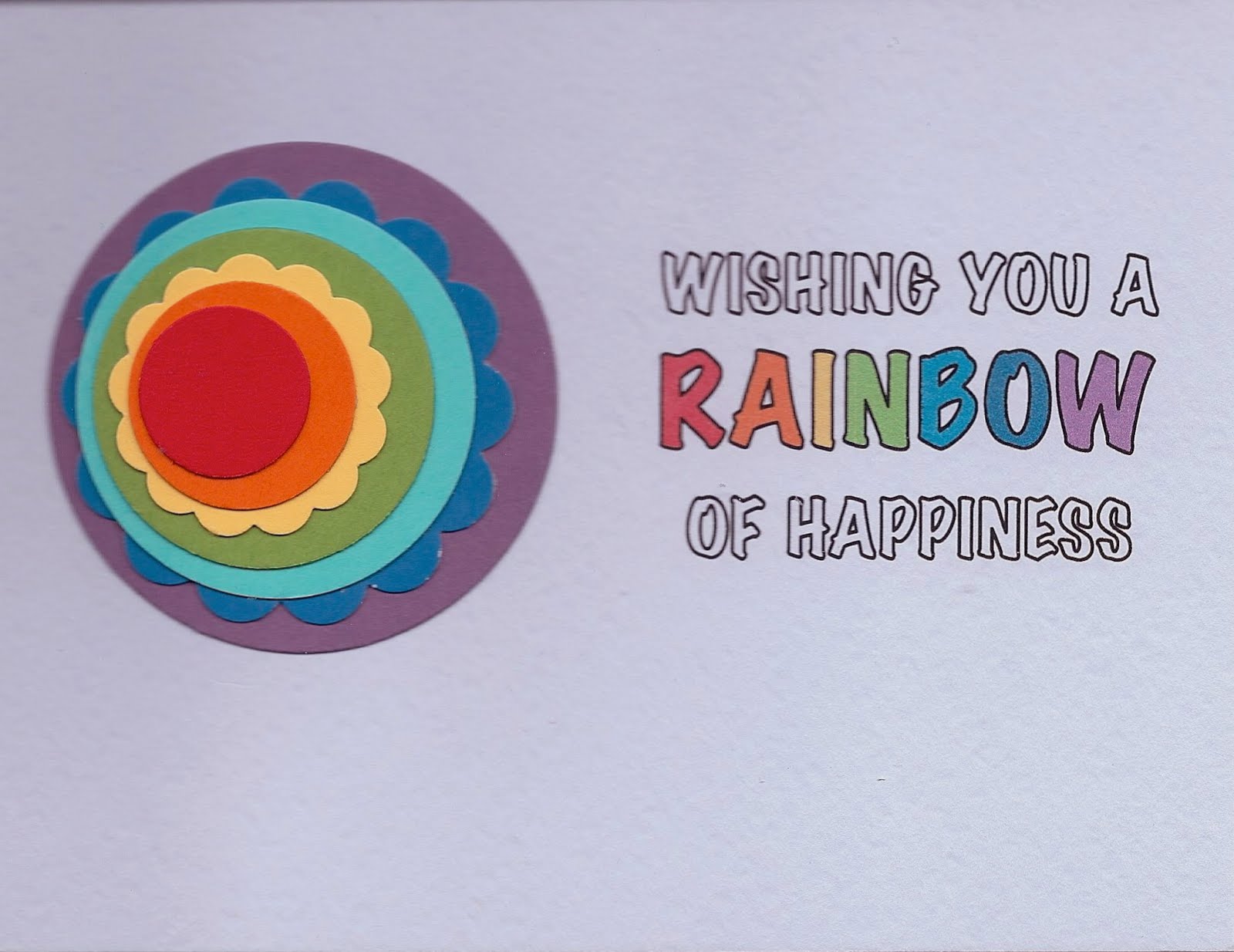
My "before" card (left) was created for the OWH "round R" challenge, using circular shapes and words or images beginning with R. I really liked my idea of "round rainbow," but the finished card just didn't make me happy. I've been wanting to go back to do something different with it, so today's seminar gave me a good excuse to work on it.
There were several different problems, but after reviewing the seminar examples, it's easy for me to see the lack of a strong focal point. My sentiment block and layered circles were visually separate and competing for attention. I like the "after" version much better.
My design changes were:
- Moved everything closer together
- Fitted the starting points of the sentiment lines around the circle (instead of centering the lines)
- Spread out the letters in the sentiment (they looked crowded before)
- Added the rainbow lines above and below the sentiment to frame it
January 30, 2011: But two things were still bugging me. The rainbow lines were upside-down (in a real rainbow, red is at the top), and though I tried to convince myself it was just multi-colored lines, it didn't look right to me. And it all seemed like it needed to move a bit to the left on the card. So I did another one (top right). Now I'm finally happy with it. See below for my "in-between" version.
Card details are in my original post. Created for Operation Write Home, "supporting our nation's armed forces by sending blank handmade greeting cards to write home on, as well as cards of gratitude to encourage them." (047b)
In-between version (below)


8 comments:
The colored lines really do pull the focal element and sentiment together. Great job with the challenge.
Wow! I can't believe the big difference that a few "little" changes can make! Thank you for detailing the changes, some were so subtle that I wouldn't have noticed but when you pointed them out and I was able to see the difference I was really surprised!
What a beautiful job of tieing the whole thing in together! I agree that the inbetween version wasn't quite right - if the purple is on the bottom of the stack, it needs to be at the bottom of the row of lines too so that they match up with each other. Your finished one looks WONDERFUL!
The colored border really does pull things together - and spreading out the letters helps a lot, it did seem crowded, but not til I looked at the 2nd version. It's so cool to see what some little tweaks can do!
The last version really draws the eye and doesn't have the split focus that the first did. The rainbow lines were exactly what it needed!
R/
The rainbow lines are the perfect addition! It really pulls it together.
the border really brings the whole thing together! beautiful job!!
Such a great job! Thanks for sharing how you did Before and After in detail.
Post a Comment