Tuesday, November 22, 2016

Blue with Brown and Light Orange

As I made yesterday's cards, I cut out the smaller label shape from the middle of my A2 card front.  That gave me a little stack of light blue dotted shapes to use, and today's card is the result.

I love these colors together.  The light orange star adds a playful touch to the more formal shapes and layout.

Card details:
  • Card stock is Paper Source papaya (light orange), Papertrey Ink (PTI) dark chocolate (brown), PTI blueberry sky (medium blue), and the bitty dot print from PTI melon berry (light orange) and spring rain (light blue) pattern packs.
  • Embossing folder is Cuttlebug candy cane stripe.
  • Dies are Avery Elle icon fill in the blank, Savvy Stamps hello, WPlus9 label layers 1 (blue shape - retired), and PTI mat stack 4 (brown shape). 
  • I used a Fiskars 1/4" star punch for the brown star, which is inlaid in the light orange star.
Created for Operation: Quiet Comfort.
(660)

Sunday, November 20, 2016

Red and Green Joy with Bird and Leaves

Our local American Legion post asked me for some Christmas cards that the group could sign, to be mailed to elderly members.  I'm always happy to support our troops and our veterans with what I make.

I like these strong, crisp colors with the soft blue background.  A green stripe anchors the label shapes, while there's a sense of energy from the accents of red and green bird, leaves, and tiny starburst.

Card details:
  • Card stock is Paper Source spruce (deep green), Papertrey Ink (PTI) pure poppy (red), stamper's select white, and the bitty dot print from PTI spring rain (light blue) pattern pack
  • Dies are WPlus9 folk art florals (bird and leaves - retired), WPlus9 label layers 1 (white - retired), and PTI wonderful words: joy, PTI star gazer (red shape inside the "O"), and PTI mat stack 4 (red).
  • I used an EK Success 3/16" punch for the red berry.
  • The card is computer-printed inside with "Merry Christmas" in red ink using Papyrus font, bold, expanded spacing.
(656)

Thursday, November 17, 2016

Two Cards with Gray Prints


I wanted to use up the medium and tiny gray chevron prints from an old 6x6" paper pad. There were also some gray frames left over from another project.  I'm happy with both cards (above and below) and especially the banner centered behind the frame on the card below.

Card details:
  • Card stock is Papertrey Ink (PTI) smokey shadow (dark gray), Hawaiian shores (turquoise), pure poppy (red), and rustic white, with three prints (including the gray-speckled red-orange on the top card) from Basic Grey PB&J 6x6" pad (retired).
  • Dies are My Favorite Things (MFT) many thanks (retired - top card), MFT notched border (retired - top card), Elizabeth Craft thanks (bottom card), PTI double-ended banner (bottom card), and PTI fabulous frames (bottom card).
Created for Operation: Quiet Comfort.
(658, 659)

Thursday, November 10, 2016

Flowers on Yellow and Aqua


This week, the Papertrey Ink "Make it Monday" challenge is assembly-line card making.  I usually make three to six cards from each of my designs.  So I enjoyed seeing Laurie Willison's tips, including: Make a sample card, do all the die cuts and stamping in advance, prepare all the layers and embellishments, finish one step at a time for all the cards, then move on to the next step, and choose the right adhesive to attach each element.

That's basically how I make my multiples, including today's set of flowery note cards.  Two of my tips to add to Laurie's: Plan a forgiving layout (or one that's easy to line up), and write some notes for placement and assembly sequence.  My first tip is illustrated in this card from last week, where the "hello" and starry strip were easy to line up on the striped paper, and the circle's position on the card base didn't need to be precise.  I used the second tip in today's card, where I wrote myself a note to adhere my dotted panel 1/8" down from the top fold and to center it over the stamped sentiment.  It's easier for me to follow a cheat sheet and not rely on memory, especially when I don't finish all my cards in one sitting. 

Card details:
Created for Operation: Quiet Comfort.
(657)

Saturday, November 5, 2016

Red Cardinal on Gray - Before and After

When I was working on yesterday's card, I found a very old swirl-embossed piece of gray.  As I started to throw it away, I thought "winter sky" and was glad I saved it.  I've found a lot of inspiration from trying to use my leftovers!

My first card (at left) used a medium green, and it seemed to need more contrast against the gray.  I prefer the second card with a darker green, but both are nice. 

Card details:
  • Card stock is Paper Source (PS) spruce (dark green - was discontinued, but is available now as a seasonal color), PS gravel (gray),  Papertrey Ink (PTI) new leaf (medium green), PTI pure poppy (red), and PTI stamper's select white.
  • Embossing folder is Cuttlebug d'vine swirls.
  • Dies are PTI winter woods, PTI keep it simple frames, WPlus9 folk art florals (retired - leaves), and Savvy Stamps hello.
  • The berries are punched with EK Success 3/16" circle punch.  I added the centers with a Copic 1.0 black multiliner. 
  • The black detail on the bird is from PTI winter woods, stamped with PTI true black ink cube.
Created for Operation: Quiet Comfort.
(654)

Friday, November 4, 2016

Striped Circle with Stars - Red, White, and Blue

My colors came from the striped print, which includes some gray with the red, white, and blue.  I like the details of the stars (die cut blue and embossed gray) and the pierced red circle.

Card details:
Created for Operation: Quiet Comfort.
(655)

Sunday, October 30, 2016

Bird on Light Green with Brown

A bright and cheerful scene with unconventional sky and leaf colors.  I like the energy of the strong color contrasts and the swirling background. 

Card details:
Created for Operation: Quiet Comfort.
(653)

Friday, October 28, 2016

Gray, Navy, and Aqua with Circles

A handsome card with circles (embossed and printed) and a diagonal panel for the sentiment.  The touches of aqua add some brightness to the gray and navy.

Card details:
Created for Operation: Quiet Comfort.
(652)

Wednesday, October 26, 2016

Aqua Panels with Brown Frame

I wrestled with my card design till I tried a diagonal placement for the frame, taken from Laurie Willison's card posted here (the last card in her post).  And it went smoothly from there.  I'm very happy with the result.  Thank you, Laurie, for your inspiration!

Card details:
Created for Operation: Quiet Comfort.
(651)

Monday, October 24, 2016

Sunshine with Aqua Dots

Bright stamped sun rays and a small die cut sun shape.  I like the bright yellow colors with the aqua and teal.

Card details:
Created for Operation: Quiet Comfort.
(651)

Sunday, October 23, 2016

Blue Floral Print with Red and White

Several shades of blue, accented with red and white stripes, a red frame, and a narrow white border.   I like the overall monochromatic look with the sparks of bright red.

Card details:
Created for Operation: Quiet Comfort.
(649)

Sunday, October 9, 2016

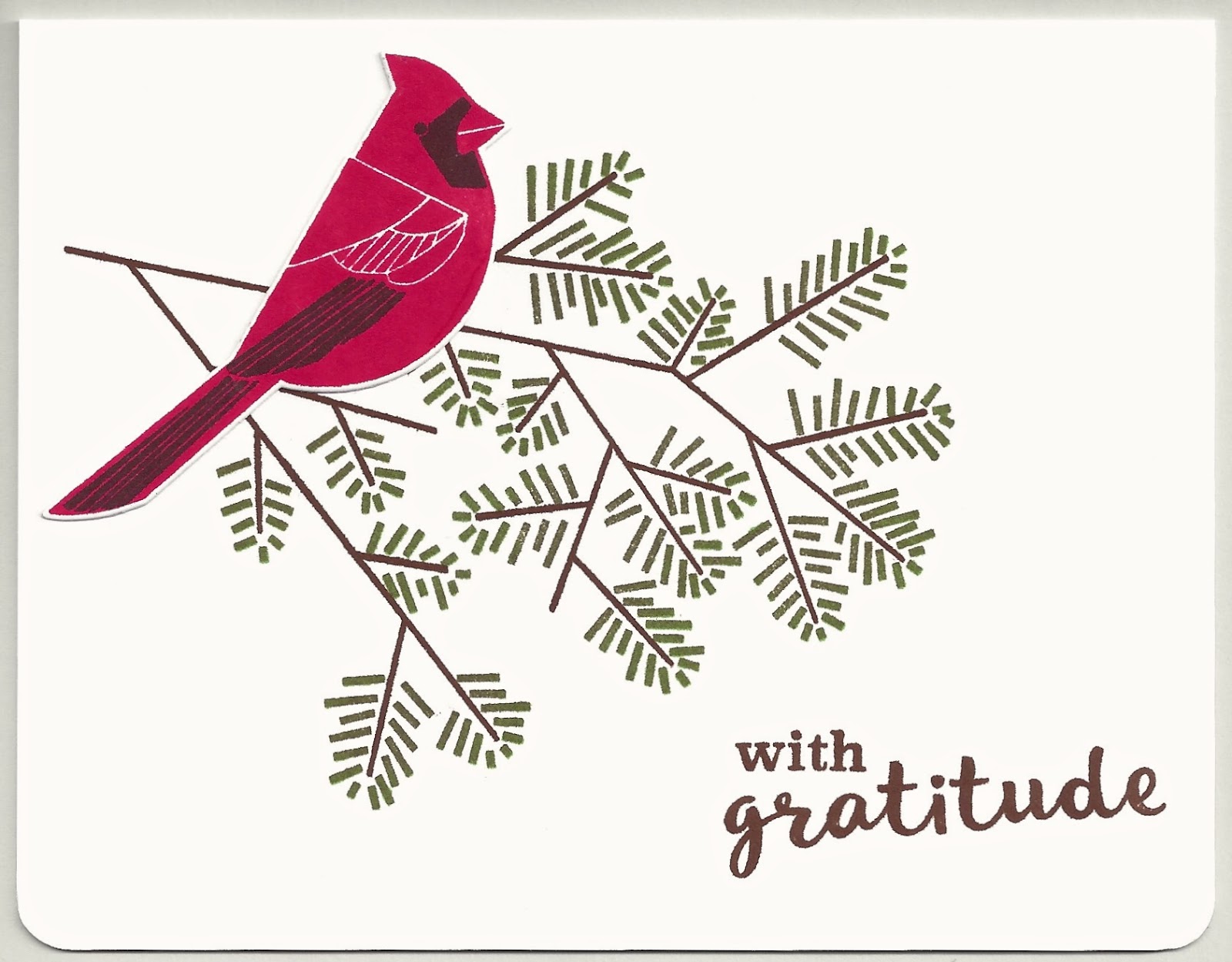
Pine Branch on White, with Bird

Two cards with a pine branch stamped on white.  A die-cut, stamped bluejay (above) or cardinal (below) adds a bit of dimension.  Simple and serene.

Note: the gray border is background, not part of the card.

Card details:
  • Card stock is Papertrey Ink (PTI) stamper's select white. 
  • Bird dies are from PTI winter woods.
  • Corners are rounded with Crop-a-Dile 1/4" corner chomper.
  • The pine branch and bird stamps are from PTI winter woods, stamped with PTI blueberry sky (blue), pure poppy (red), smokey shadow (dark gray), dark chocolate (brown), new leaf (bright green), and olive twist (gray green) ink cubes.
  • The sentiment "with gratitude" is from PTI spring woods, stamped with PTI dark chocolate ink cube.


Created for Operation: Quiet Comfort.
(648)

Friday, October 7, 2016

Turquoise Sun with Dots

When I made these sunshine cards, I inlaid the deep yellow sun into the turquoise card front - leaving me with some "scrap" turquoise sun shapes.  The scrap is featured in today's card, with a variety of stamped, embossed, and die-cut dots.  There's a nice energy and contrast in the shapes and colors.  And I do love using my leftovers!

Card details:
Created for Operation: Quiet Comfort.
(646)

Sunday, October 2, 2016

Gold Diamonds and Red Squares

The subtle colors in the patterned paper became a bold, rich color scheme for my card.  I like the diamonds, squares, and stripes with the flowing script of "hello." 

Card details:
  • Card stock is Papertrey Ink (PTI) saffron spice (deep gold), pure poppy (red), tropical teal, and a print from Pink Paislee portfolio 6x6" pack.
  • Embossing folder is Lifestyle Crafts diamonds and dots.
  • Dies are Savvy Stamps hello and the inner "scrap" cuts from My Favorite Things retro squares border (retired).  The border was used on this card.
Created for Operation: Quiet Comfort.
(645)

Saturday, October 1, 2016

Two Cards with Circle Border Strips

I used the circle border strip in two color combinations with similar layouts.  Although I like them both, the one above is my favorite.  And the circles die (Papertrey Ink simple circles border) had been on my wish list for many months, so I'm glad I finally put it in my shopping cart!

Card details:

Created for Operation: Quiet Comfort.
(644)